
Designing a data exploration system for millions of IoT data streams
User Scenarios | System Guidelines | Wireframes | User Testing | UI & Interaction Design | UI Spec
Role
User Experience Lead
Team
1 PM, 2 Engineers, 1 UX
Time frame
Project
New strategic initiative
8 months
Data Visualizer: Project Background
With the rise of solar and EV adoption, utilities needed better ways to analyze usage trends and understand energy demand at scale. However, the existing Meter Data Management (MDM) system was built for a narrow use case—resolving meter read issues—and lacked the flexibility to support broader analysis.
While vast amounts of data were available in the database, the UI limited users’ ability to explore, compare, and act on it.

Legacy UI lacks data analytics capability.
Goal
Our goal was to design a flexible, on-demand analytics experience that allows users to navigate complex datasets, uncover insights, and support evolving use cases such as net metering, load planning, and cross-source analysis.
To reduce engineering overhead and avoid building a custom-coded chart, leadership decided to leverage Highcharts as the underlying charting library.
As a new initiative, this work was focused on defining the system and validating direction with stakeholders, rather than optimizing against established metrics.
My Role
As the sole designer, my challenge went beyond just the UI. I had to understand the underlying system, technical infrastructure that determines how data is passed, configured, and surfaced on the UI.
My contributions
-
Alignment with product and engineering on implementation approach, trade-offs, and priorities
-
Metadata schema to support scalable chart configuration
-
UI and interaction design
-
User interviews / Usability testing
-
Resolution of technical design challenges in close collaboration with engineering
-
MVP scoping and negotiation of deliverables
First, I sat down with the PM to understand the requirements
The challenge was that this was a net-new feature with no prior baseline. We also had limited time for user research. To move forward, I partnered closely with the PM through multiple rounds of ideation to define key hypotheses and user scenarios.
To effectively analyze trends or resolve operational issues, users cannot look at consumption data in a vacuum. They must cross-reference and correlate with various other data sources (e.g., weather, events, time-based comparisons).
Core user scenarios
-
Select data channels to visualize multiple data streams
-
Customize charts based on user preferences
-
Save and reuse chart configurations

Brainstorming sketches of how to select data and save a chart as a favorite.
Defining the System (UI Models & Data Flow)
Before jumping into the UI, I collaborated with engineering to align on the underlying data models. I created system-level diagrams to map our high level decisions about what components we need, and how they pass data across the chart UI.

Design Principles & System Guidelines
To define the capabilities of the data visualization experience, I established a set of design principles and system-level guidelines. These decisions were grounded in user needs, technical constraints, and the capabilities of the charting library, informed by a deep review of the Highcharts API.
Rather than designing chart features screen by screen, this approach ensured the system would be scalable, configurable, and extensible over time.
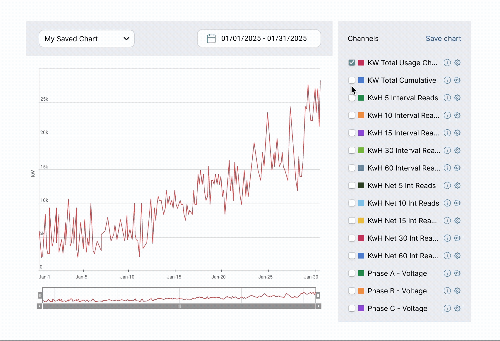
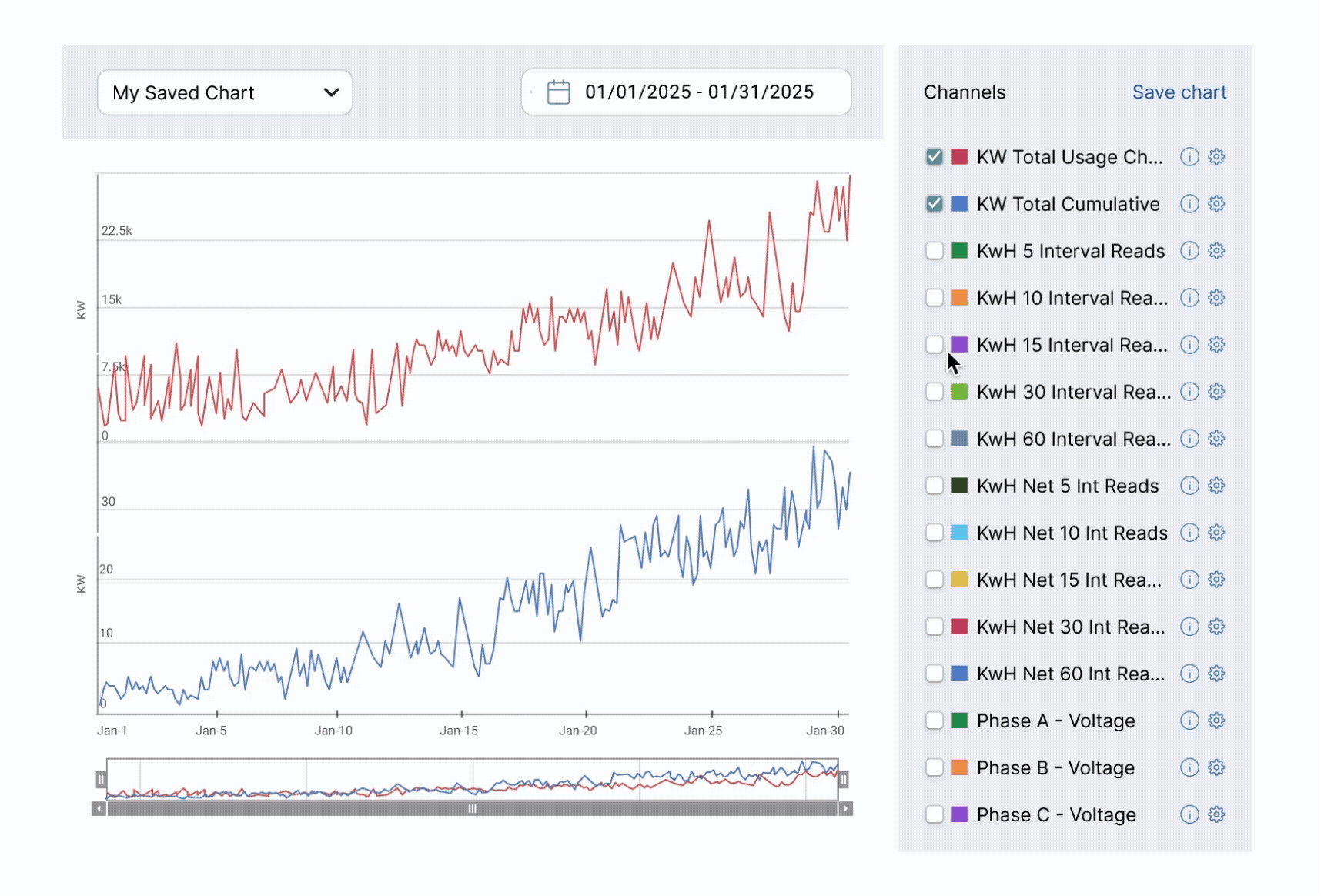
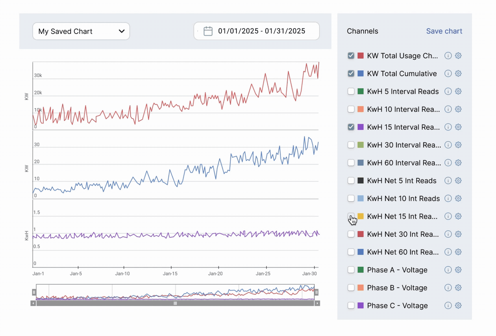
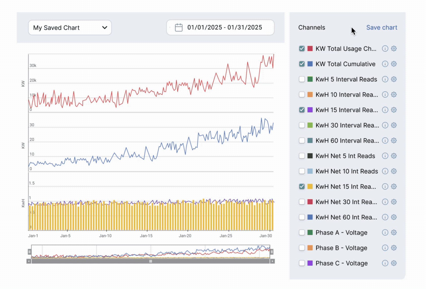
Data Visualizer (Core Experience)
The data visualizer is designed for time-series analysis, where the X-axis represents dateTime and the Y-axis represents measurement values.
-
Users can plot multiple Service Delivery Points within a single chart to enable comparison across data streams
-
System limits are based on data volume and performance, rather than the number of selected series
-
Each data series is individually configurable (e.g., color, chart type), supporting flexible analysis workflows
-
Date/time formatting is controlled at the global level, ensuring consistency across views while allowing user preference
Chart Behavior & Interaction Model
To ensure consistency and usability across different chart use cases, I defined default behaviors and interaction patterns:
-
Chart titles are handled outside the visualization, allowing greater layout flexibility and clearer hierarchy
-
Legends can be hidden and restructured as a selectable list, improving usability in multi-series selection
-
Zoom is enabled by default, with a zoom reset button to support exploratory analysis
-
A navigator is included to provide temporal context and enable efficient range selection
-
Tooltips are enabled by default to support data inspection, with flexibility to disable them for simplified views (e.g., compact trend charts)
These guideline formed the metadata structure required to support dynamic chart configuration—laying the foundation for a scalable, reusable analytics platform.

UI & Interaction Design
With these decisions in place, I moved into wireframes with the goal of gathering feedback early on.

Usability Testing
I conducted two quick internal usability tests with subject matter experts and two customer feedback sessions, which revealed the following key insights:
High level feedback:
-
Need to accommodate for adding different types of data (e.g., comparison datasets, weather data, event data, time-shifted data)
-
Handling differences in measurement units when comparing datasets
-
Leveraging existing patterns (e.g., reusing “Save Search” for “Save Chart”) to maintain consistency
Iteration & Key Improvements
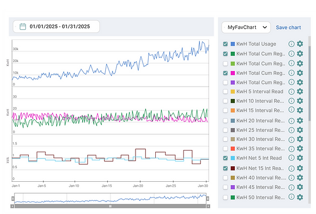
A. Comparing Complex Datasets
One of the core challenges was enabling users to compare multiple datasets when the range of y-values is vastly different.
To address this, I introduced Synchronized Charts from Highcharts. It supports up to 3 slots, each acting as its own canvas. Slots have shared interactions (e.g., hover, zoom) across slots for easy comparison, and users can add multiple data series per slot.
This allows users to visually compare datasets while maintaining clarity and reducing cognitive load within the limited chart space.

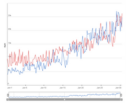
One slot enabled with two data streams in it.

Two slots enabled, single data stream in each slot.

Using all three slots. Two data streams (yellow and green) are plotted in the middle slot.
B. Supporting Different Data Types
Another improvement was around how to add data types that are different in nature. Users needed to compare raw data across different contexts, such as comparing energy usage of this house with a different household, comparing consumption trends over time (e.g., weekly, monthly, yearly), and understanding how energy consumption changes in relation to weather data.
Each data type behaves differently, so I designed distinct interaction patterns for each type based on what made the most sense.

For time-based comparisons, users can configure them within the original channel options because they use the same dataset, only shifted in time.

For separate data types like device alerts and weather, users can add them through 'Advanced Data' section. I designed the forms and defined the exact fields required to properly plot the data.

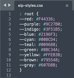
C. Assigning Colors to Data Series
Instead of allowing users to pick from an infinite range of colors (e.g., hex codes or a color wheel), I limited the selection to a dropdown list of 10 predefined colors. The colors are sufficiently distinct, and a set of 10 is large enough, as it’s unlikely users will need to view more than 10 data series at once.
These colors were defined in the global stylesheet.

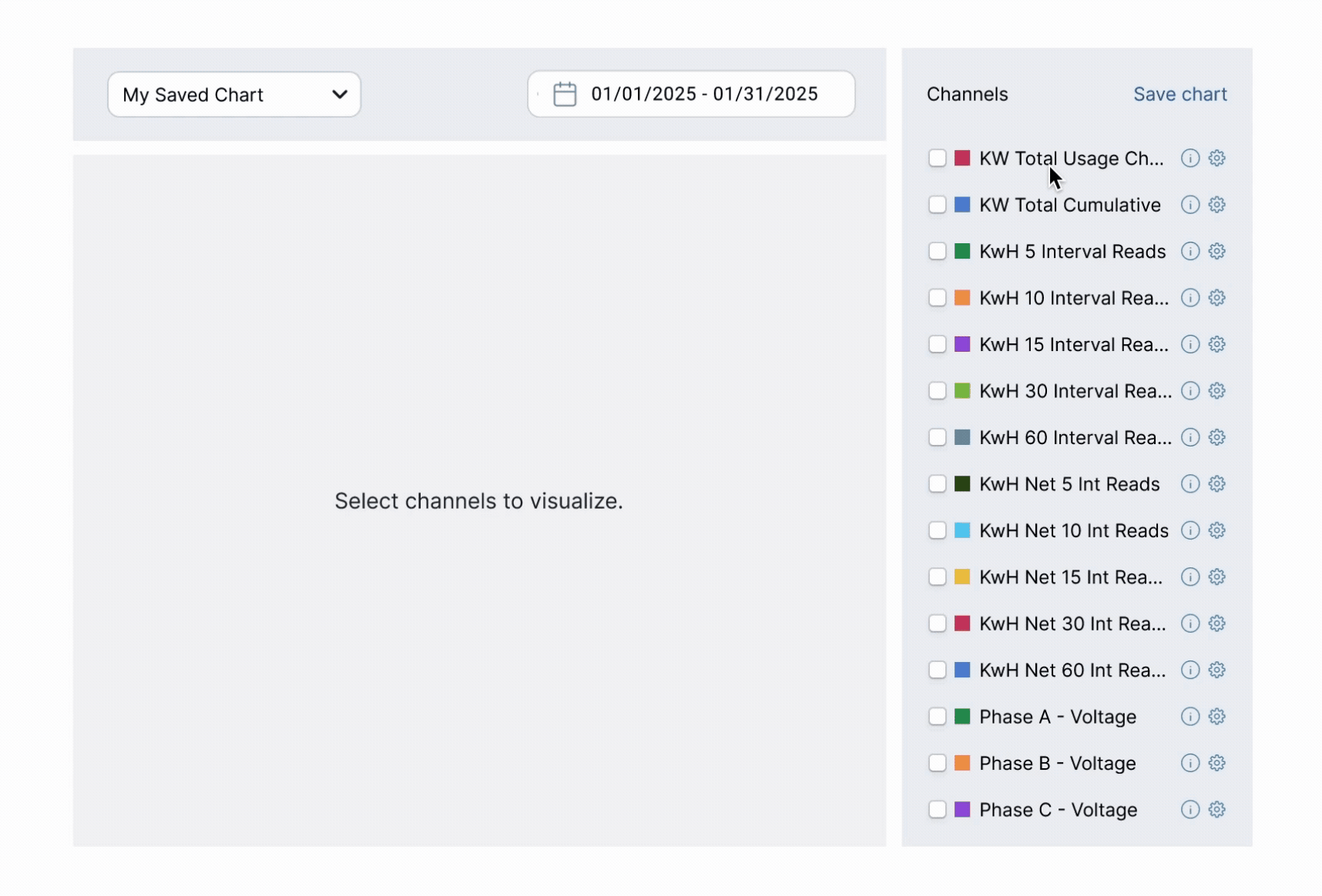
D. Clarifying Empty States
Another area of improvement was around system feedback. Users often struggled to distinguish between no data available, zero-value data, and system errors.
I introduced explicit empty states aligned with system-wide patterns, making these scenarios clearly distinguishable and reducing confusion during analysis.

Before

After
Design Solution

Add data
Users review channel information and add the data they are interested in.
Compare data
Users can analyze and compare data points to understand their relative values.
Customize chart
User can change how they want the chart to look.
Save and load chart
Users can save the chart configuration to reuse it later.


Additional Design Process
I conducted foundational research to gain insights about existing tools and users.

Competitive benchmarking of data visualization tools

Two key personas representing the primary users of the chart
I evaluated multiple scenarios to answer question "Where should users begin chart exploration?"
User scenarios

Tradeoffs & Prioritization
Throughout the project, I made deliberate tradeoffs:
1. Flexibility vs Cognitive Load
-
Limited visualization to a 3-slot model
-
Prevented exponential complexity in multi-variable comparisons
→ Ensured scalability of interaction model
2. Discoverability vs Efficiency
-
Separated event data vs time-shift configuration
→ Optimized for expert workflows over first-time usability
3. Reusability vs System Complexity
-
Introduced saved configurations
-
Avoided fully dynamic query-building system (too heavy for MVP)
→ Balanced speed vs long-term extensibility
4. Ideal UX vs Technical Constraints
-
Designed within capabilities of Highcharts
→ Reduced implementation risk and improved delivery speed
These decisions prioritized immediate usability while keeping the system extensible for future needs.
Results
The new data visualizer laid the foundation for improving how users interacted with energy data, particularly in exploratory and comparative workflows.
Product impact
-
Supported a shift from reactive troubleshooting → proactive analysis, especially in emerging use cases like solar and EV planning.
-
Introduced scalable charting system reusable across the platform
Business impact
-
Contributed to securing the first SaaS customer deal
-
Became a core feature of the NextGen UI rollout
-
Generated 5 customer evaluations within 6 months
User feedback
-
Strong excitement in solar and EV analytics use cases
-
Requests for additional chart types and performance improvements
What this enables
-
Supports proactive energy planning (solar, EV adoption)
-
Cross-data analysis (channel data, time-shifted data, event data)
-
Efficient usage pattern detection
-
Reusable analytics frameworks
What I'd Do Next
Due to the on-premise nature of most customers, direct usage metrics were limited. Instead, impact was assessed through stakeholder validation, customer evaluations, and sales pipeline.
If given more time and data access, I would:
-
Measure adoption (e.g., saved chart usage)
-
Track time-to-insight improvements
-
Improve performance for large datasets
-
Expand comparison capabilities and chart types
Key Takeaways
Designing for enterprise systems requires thinking beyond UI
-
Defining scalable interaction models
-
Aligning with data architecture
-
Making deliberate tradeoffs between flexibility, usability, and system complexity